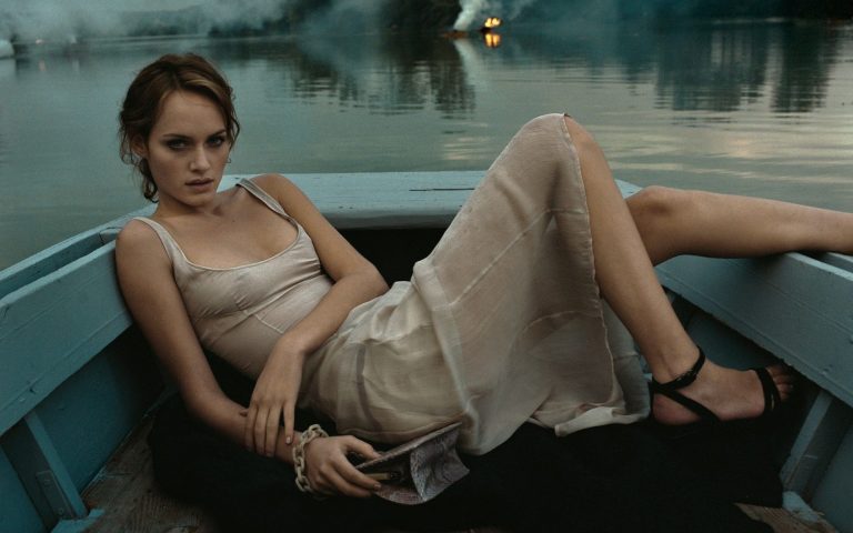
It’s always a good idea to save money, but even better to save it in plain sight. With this in mind, some fashion campaigns in recent years seem to have abandoned the setting, the story and the general creativity, settling for models sitting against a neutral background. A bit like LinkedIn portraits, where they have to look at the camera, with their arms folded and a smile. Ten years ago, branding (or as we might call it in Italian “homogenization of style”) affected brand logos, where fonts, accents and parts that were too complex for the masses to understand were quickly lost. Now it’s the turn of campaigns: models pose against monochrome backgrounds, logos are prominently displayed and there is literally nothing to distract attention from the product. Of course, there are exceptions: the latest campaigns of Dior, Bottega Veneta, Louis Vuitton, the beautiful campaigns of Moschino and, to some extent, of Kenzo. But for the most part, people have had to make do with blank backgrounds, sterile, undefined places that look like offices, and in the most extreme cases, modest interiors or exteriors such as swimming pools, nameless concrete or brick walls, bourgeois rooms with barely visible lawns, etc. It reminds me of all the precautions that budget-conscious fashion students adopt in their projects, but brands flush with money shouldn’t. Where has the art direction gone?
The topic has resurfaced thanks to StyleZeitgeist and the anonymous Substack post “White trash: the death of art direction,” which extends the issue beyond campaigns to magazine editorials, where blank backgrounds have become the cinematic equivalent of green screens, lending everything an unpleasantly artificial and dated feel. “When does a less-is-more approach to luxury image-making become indistinguishable from the most average e-commerce property?” asks a provocative Substack post. In fact, we’ve been thinking about it a lot lately, especially given the widespread archival mania that has seen many, not just experts, resurrecting old catalogs from J.Crew or JC Penney that, without luxury bags, exorbitantly priced clothes or supermodels, managed to fulfill the main task usually assigned to campaigns: creating an imaginary world and transporting the viewer into it. According to Eugene Rabkin, this process was already underway, but it erupted with the pointless controversy over the Balenciaga campaign, so frightening the executives of each brand that “brands are now in constant potential crisis management mode, and as a result, self-censoring.” The result, quoting critic Roman Meinhold, is the gradual elimination of what the journalist calls “metagoods”: accessory symbols that enrich the narrative of a particular brand. Think of the vintage cars, motorbikes, and American landscapes of the old Ralph Lauren campaigns, the somewhat salacious situations depicted in Tom Ford’s Gucci campaigns, and the vibrant art direction of the ultra-dynamic Dior campaigns of the Galliano era.
Actually, there is something to point out. Even in the 90s, campaigns with neutral backgrounds were common. Many of the Versace and Chanel campaigns were, for example. Also, some vintage Armani campaigns used somewhat ambiguous urban backgrounds. But they were not the default for fashion photography, and it was also a time when (as much as I hate to say it) brands could differentiate themselves by their clothes alone. The mood was so easy to understand that even with a neutral background, the pose of the model, the intimacy and distance of the shot was enough. There were also far fewer competing campaigns, so a brand like Jil Sander could afford to present a campaign where only Amber Valletta’s face emerged from a pink damask background, and not even her dress was visible. The same could be said about Helmut Lang’s strict campaigns (which still had a certain coldness to them) and Calvin Klein’s campaigns. Studio campaigns coexisted with “staged” campaigns that immersed the costumes in a realistic context, using props, poses and movements even in the emptiness of photo sets, embracing different moods, in short, creating an atmosphere. The most successful campaigns, especially those of Prada and Miu Miu, also created a sense of mystery, referencing Psycho and The Shining, while a spectacular campaign for SS97 showed Amber Valletta lying on the bow of a boat, surrounded by the waters of a lake, with fire and a forest shrouded in mist on the shore.
These campaigns were born with the goal of creating strong images, even if minimal, rather than showing the clothes (or rather, not only showing the clothes). Even the group shots and realistic close-ups used by brands like Comme des Garçons told a story. And it’s not like these campaigns were overly elaborate than usual. In every era, the goal is to do more with less and to economize, but you notice that the attention to the gestures, expressions and relationships of the people in the photo creates the story. Today, many of the subjects of the campaigns, especially celebrities, are photographed in a line or isolated in the photo, oscillating between awkward and caricatured poses, but all poses that even The Guardian defines as “awkward” cannot hide the total lack of effort that went into the conception and preparation of the shoot, revealed by the complete nudity of the set. For Lapkin, the problem is that “today creativity is not considered potentially profitable.” This is a reasonable idea in an era that seems eager to integrate the predictive power of algorithms, their results that always return accurate formulas. The point is, fashion doesn’t need precise formulas. Common sense is necessary, but to sell anything else, you need individuality. After all, isn’t individuality the symbolic commodity you’re really buying when you choose and buy a dress?


